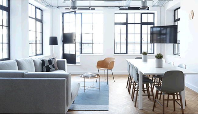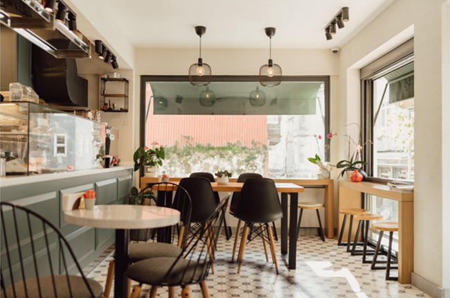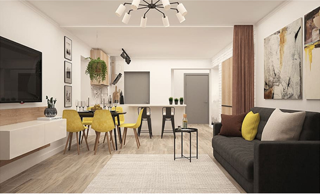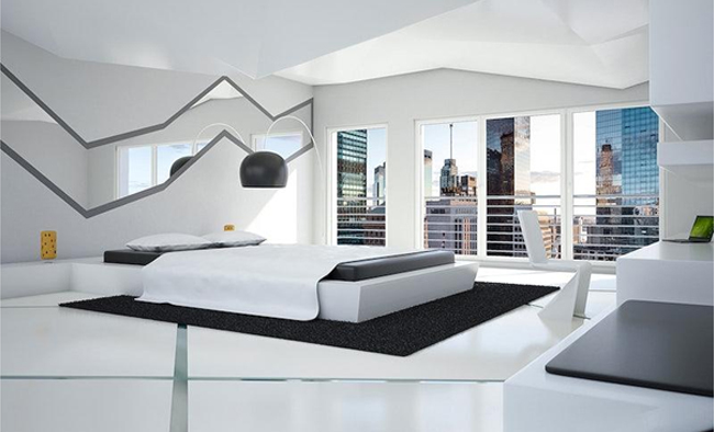
The interior design incorporates all the elements of an interior space. While most designers say, there are no rules to design, there are still some basic rules that they follow and use in creating beautiful interior spaces.
While there is no one-size-fits-all formula in interior designing, understanding a few basic rules would help you coordinate with a professional to achieve the design elements you want in your home or office.
A well-designed interior space not only looks appealing but also improves the quality of life. Whether you are building a new home or renovating an existing one, you can use interior design to beautify your home. So, let us know the basic 7 principles of interior designing you must follow.
Get to Know Your Space
Interior design covers everything from little features to the overall functionality of a space. Therefore, the first step in interior designing is to know your space well before you start thinking of making changes. It is always advisable for homeowners to live in their space and have an idea of the space they have, before making any changes. After incorporating some design elements, you should have sufficient space to move around.
If you are planning to become an interior designer, let me tell you that it’s a great profession to grow in life and career. You get a chance to show your creativity and earn a high income. The average annual income of an interior designer varies from $40,000 to $78,000 which is sufficient to lead a fulfilled life. An easy way to enter this creative industry is to take a course in interior design. There are many online interior design learning resources that offer you the best courses in this field. You can choose any course and open the doors to a great career.
Achieving Balance in Interior Design
The visual balance is the hallmark of a well-designed space. Whether it’s a room or an open space, you can create a visual balance between different elements in that space. A properly balanced space exudes calmness and confidence in its design. To have a better understanding of the balance in interior design, let us take a look at the three types of balance.
The Principles of Interior Design Balance
Balance is categorized into three sub-types: radial, asymmetrical, and symmetrical. These principles serve as the foundational building blocks of interior design.
- Radial Balance

Radial balance is about harmonizing elements around a focal point, typically circular. For instance, consider a round center table surrounded by sofas or chairs. To achieve radial balance, the surrounding objects must mirror the symmetry of the central circular element. It creates a visual equilibrium in the space.
- Asymmetrical Balance
In contrast to radial balance, asymmetrical balance doesn’t rely on strict symmetry. Designers employing this approach intentionally avoid mirroring objects exactly. Instead, they arrange elements thoughtfully to enhance visual appeal. Asymmetrical balance often contributes to an informal and dynamic interior design style.
- Symmetrical Balance
Symmetrical balance is placing the identical or similar objects in a manner that creates a sense of equilibrium. This is often achieved by positioning two objects opposite each other, such as placing two sofas facing one another. Symmetrical balance imparts a sense of formality and order to the interior space.
Unity
Our minds are naturally wired to appreciate simplicity. Unity has a special way of soothing our minds and making a space more appealing. One effective approach is to select a single color and ensure that all the colors of objects within the room harmonize with it. Among the seven fundamental principles of interior design, unity holds a position of utmost importance.
You see when you mix and match various elements haphazardly, it can throw off the overall harmony of a space. To maintain a sense of cohesion and serenity, it’s best to stick with elements that complement each other.
Rhythm
It is impossible to achieve harmony in interior design without rhythm. But what do we mean by rhythm in interior design? Rhythm is the right use of colors, textures, and patterns to create visual interest in a space. For example, you enter a room, and the colors, textures, and patterns are designed in a way to guide your eyes to see everything in a flow.
Another example of rhythm is to use the same colors in a room at various intervals. You can compliment a blue wall with blue cushion covers on a sofa placed against a wall of different colors. Rhythm is all about crafting a harmonious experience within an interior design. It comes in three distinct forms: repetition, transition, and progression.
Principles of Interior Design: Rhythm

Repetition:
This is the simplest form of rhythm, and it’s best employed with a light touch. Imagine sprinkling pops of orange throughout a room; this subtle repetition can work wonders. However, it’s essential to strike a balance, as too much repetition can be as grating as listening to the same techno track day in and day out!
Transition:
Transition, on the other hand, is a bit more nuanced. It serves as a gentle guide, smoothly leading the eye from one object or room to the next. Arched doorways, well-placed windows, and graceful furniture curves are the go-to tools for achieving transition
Progression:
Last but not least, there’s progression which involves grouping similar objects of different sizes. Think of a collection of seashells, candles, or even pumpkins, ranging from small to large—it’s all about creating a sense of progression in the space.
Scale and Proportion
When you step into a room and feel like the furniture is lost in a sea of space or overwhelmed by its surroundings, you’ve encountered the critical concepts of scale and proportion.
Scale deals with the size of objects within a room. It’s about ensuring that everything within the space feels just right in terms of size. Imagine a vast room with tiny furniture or a cramped space with bulky furnishings – both scenarios can disrupt the visual balance.
On the other hand, proportion is all about the relationship between one object and another. Picture a massive, plush chair paired with a minuscule side table; the proportions are clearly off. In contrast, pairing a delicate slipper chair with a suitable side table creates a more visually pleasing harmony.
Contrast
Like a pinch of salt in a recipe, a dash of contrast can enhance the overall appeal of a space.
One of the most effective ways to introduce contrast is to use colors strategically. The stark interplay between black and white, for example, can make a bold visual statement in any room.
The form also plays a role in contrast. Imagine a room featuring a large round mirror positioned above a sofa, accompanied by a round side table and two square ottomans repurposed as a coffee table.
Moreover, contrast extends to the interplay of positive and negative space within a room. Just as you have areas bustling with visual activity, it’s equally vital to incorporate zones of empty, or negative, space.
Details
Throughout history, people have employed intricate details to adorn their spaces. Consider the hand-carved doors discovered at the ancient Indus Valley archaeological sites or the Mongolian rugs adorned with tiny fiber pluffs.
Principles of Interior Design: Details

Let’s dive into the world of details with three illustrative examples:
- Clay Carving: Imagine clay pots adorned with intricate carvings. These carvings are the epitome of detailing, but interestingly, without the detailed designs, the pots themselves might lack value.
- Wooden Furniture: The allure of wooden furniture often lies in its meticulously crafted designs and intricate cuts. Wooden furniture contributes to the overall attractiveness of the pieces.
- Ceiling Patterns (POP): Patterns adorning a ceiling, often created using Plaster of Paris (POP), can greatly enhance the visual appeal of a room.
Emphasis
In the world of interior design, emphasis is all about creating focal points within a room. A focal point, whether achieved through color, a unique component, texture, or pattern, serves as the center of attention around which the entire decor revolves.
A room lacking a focal point tends to be forgettable and lackluster. Emphasis addresses this issue by pinpointing one standout element in the room.
Whether you’re working with a cozy small space or a sprawling room, the principle of emphasis can be applied. In smaller rooms, a focal point helps unify the space and prevent it from feeling disjointed. In larger rooms, you have the creative freedom to experiment with various elements, creating multiple points of interest that captivate the eye.
Summing Up
Interior design is a great field where professionals work to make the best use of the available space in your home or office. Taking care of the balance, rhythm, scale, proportion, and emphasis helps you to incorporate every element you want in your home interior. Having knowledge of these principles enables you to coordinate with your interior designer to create a luxurious living environment at an affordable price.
Leave a Reply